Simplifying a complex website experience for 43,000+ governance professionals

.jpg)
Tools used -



.svg.avif)
Context
I was brought in by Portable, a leading Australian UX design agency, to lead the UX/UI redesign of the Governance Institute of Australia’s website.
With roots dating back to 1891, Governance Institute of Australia is a long-established professional association supporting more than 43,000 governance, risk, and compliance professionals. The redesign focused on transforming a complex, content-heavy website into a clearer, more intuitive experience that made it easier for users to navigate, search, and access the Institute’s extensive resources, education, and services.
The challenge
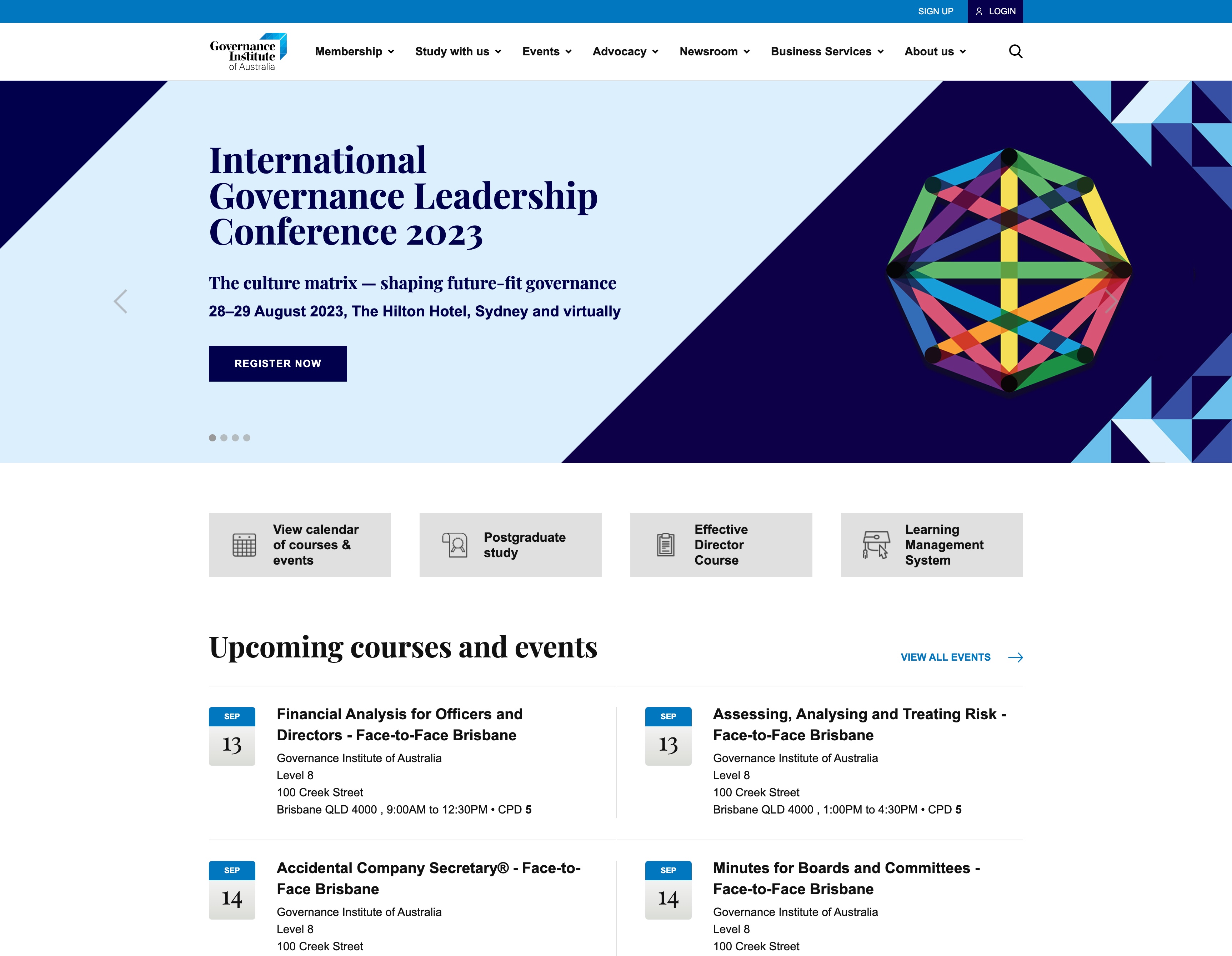
The existing website contained a significant amount of valuable content, but its complexity made that information difficult to discover and navigate.
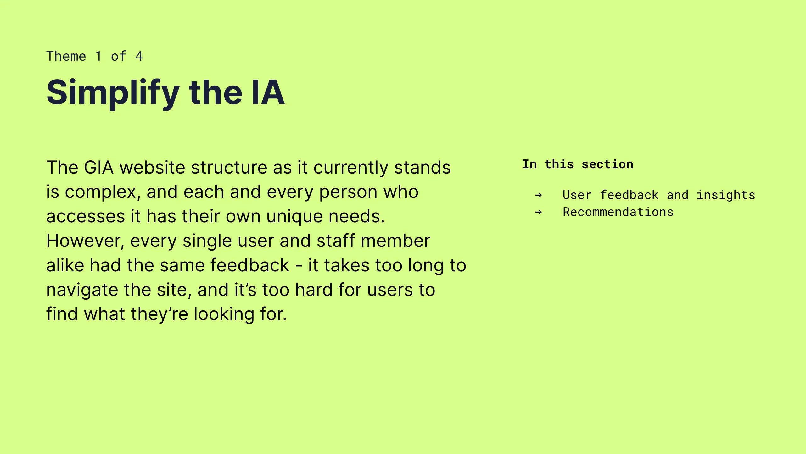
The site had an average bounce rate of 62%, users were spending relatively little time exploring content, and a complicated information architecture made it difficult to understand where to go next.
Search functionality was limited, navigation lacked clarity, and inconsistent visual design further contributed to a fragmented user experience.
The challenge was to simplify the experience without oversimplifying the depth of information Governance Institute needed to provide to its diverse professional audience.
Click on image below to see user research:
The solution
Introduce a significantly simpler information architecture and navigation system, helping users understand the breadth of Governance Institute’s offering while reaching relevant content more efficiently.
Improve search content discovery across the Institute’s extensive library of resources, education, events, and professional information.
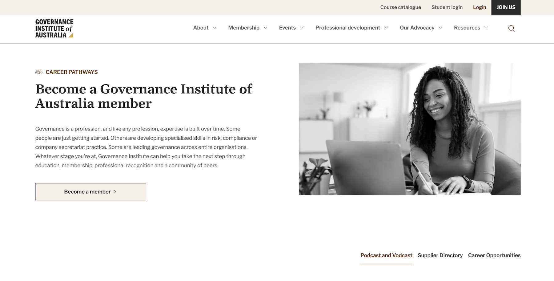
Bring a refined visual system with greater hierarchy, consistency, and clarity to the interface, while making content strategy shift toward helping users quickly understand what information was available and what actions to take next, while preserving the depth and authority expected from a long-established professional institution.
What I did
I worked across research, strategy, information architecture, UX, and visual design to define a clearer direction for the new website.
Discovery & research
I reviewed existing user research and conducted a comprehensive site audit before working closely with stakeholders through alignment sessions, brainstorming, and discovery exercises.

UX Strategy
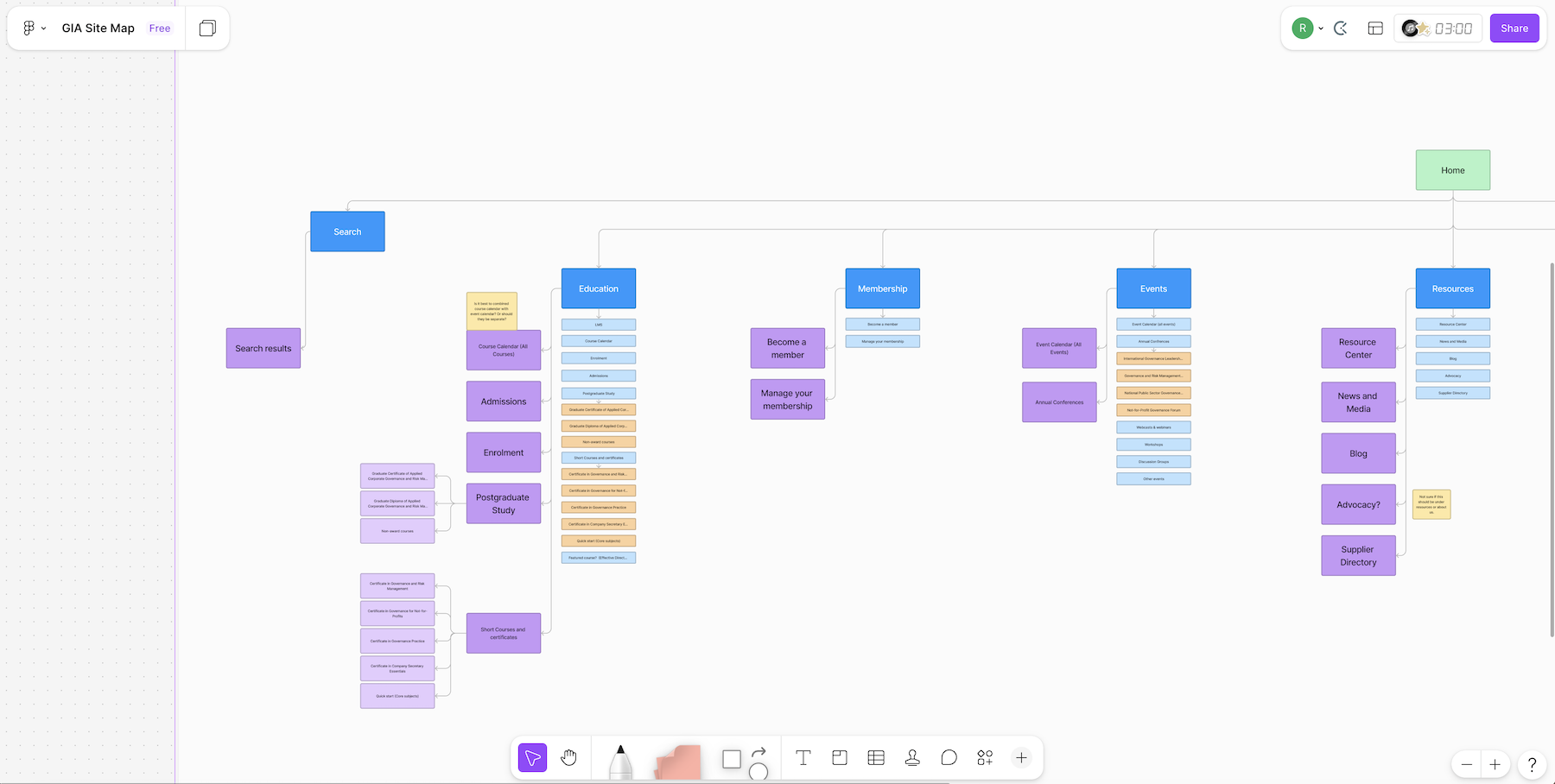
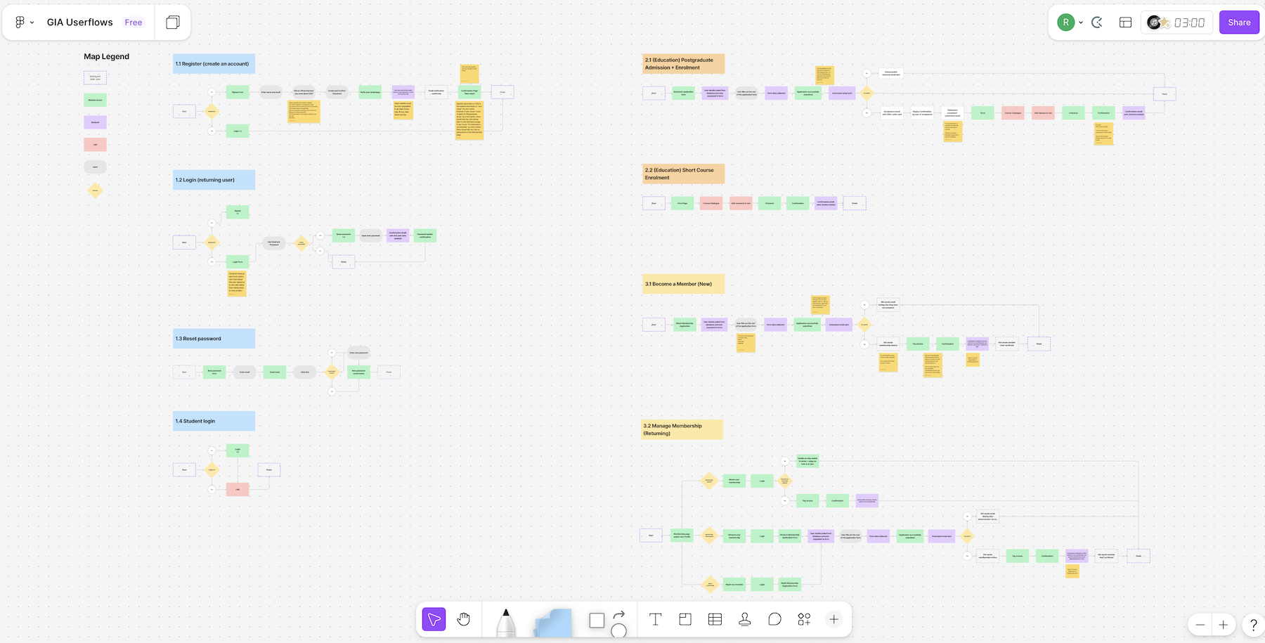
From data gathered from a card sorting workshop, I developed the site architecture, sitemap, user flows, and user stories to establish a stronger foundation for the experience.
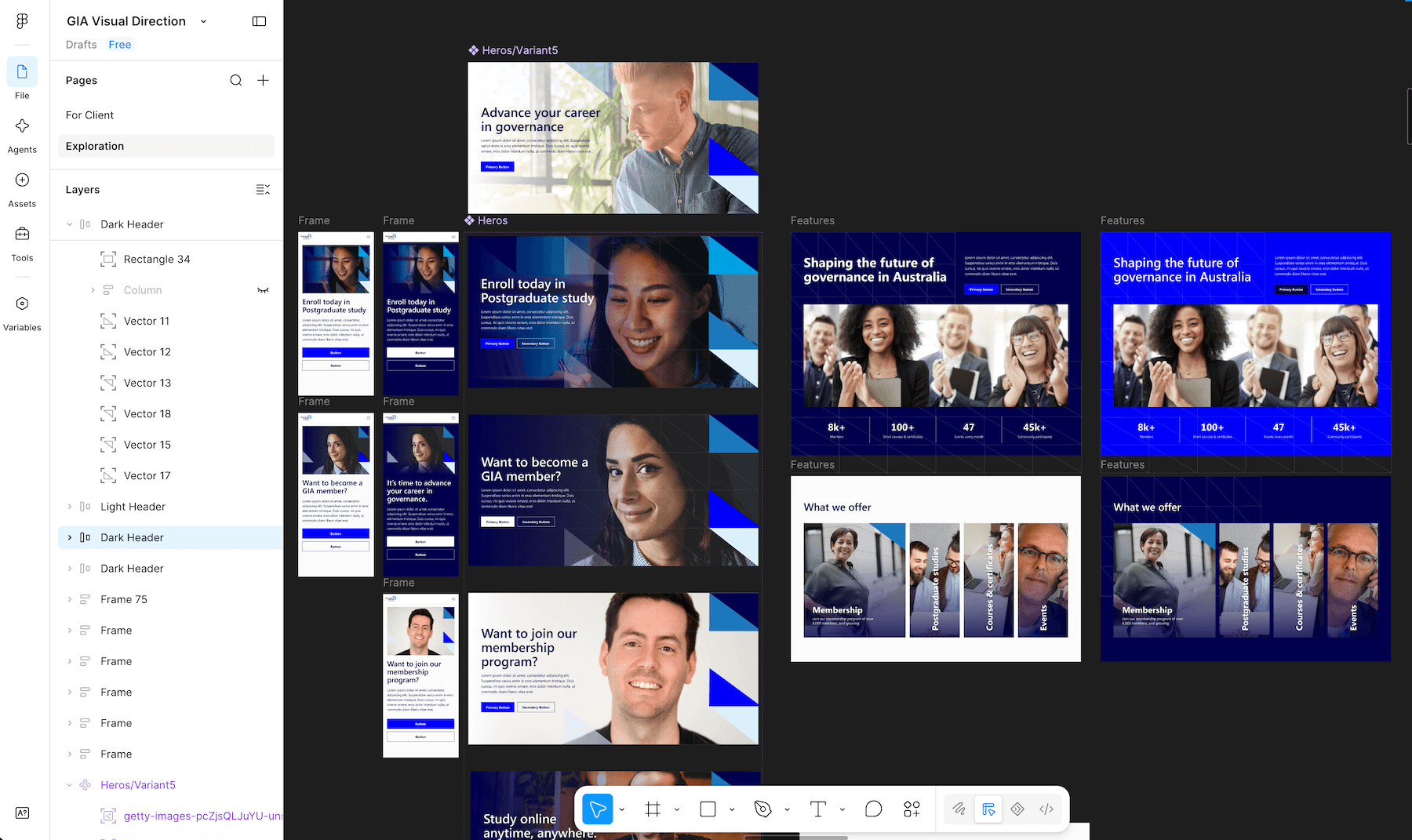
Visual direction exploration
I explored multiple visual directions for the interface, developing custom, scalable graphics and design concepts that helped define the overall look and feel. The selected direction was refined through stakeholder feedback before receiving final client approval.
.jpg)
.png)
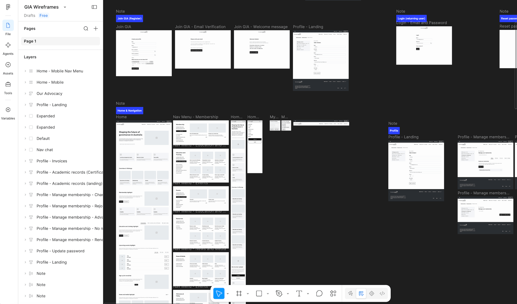
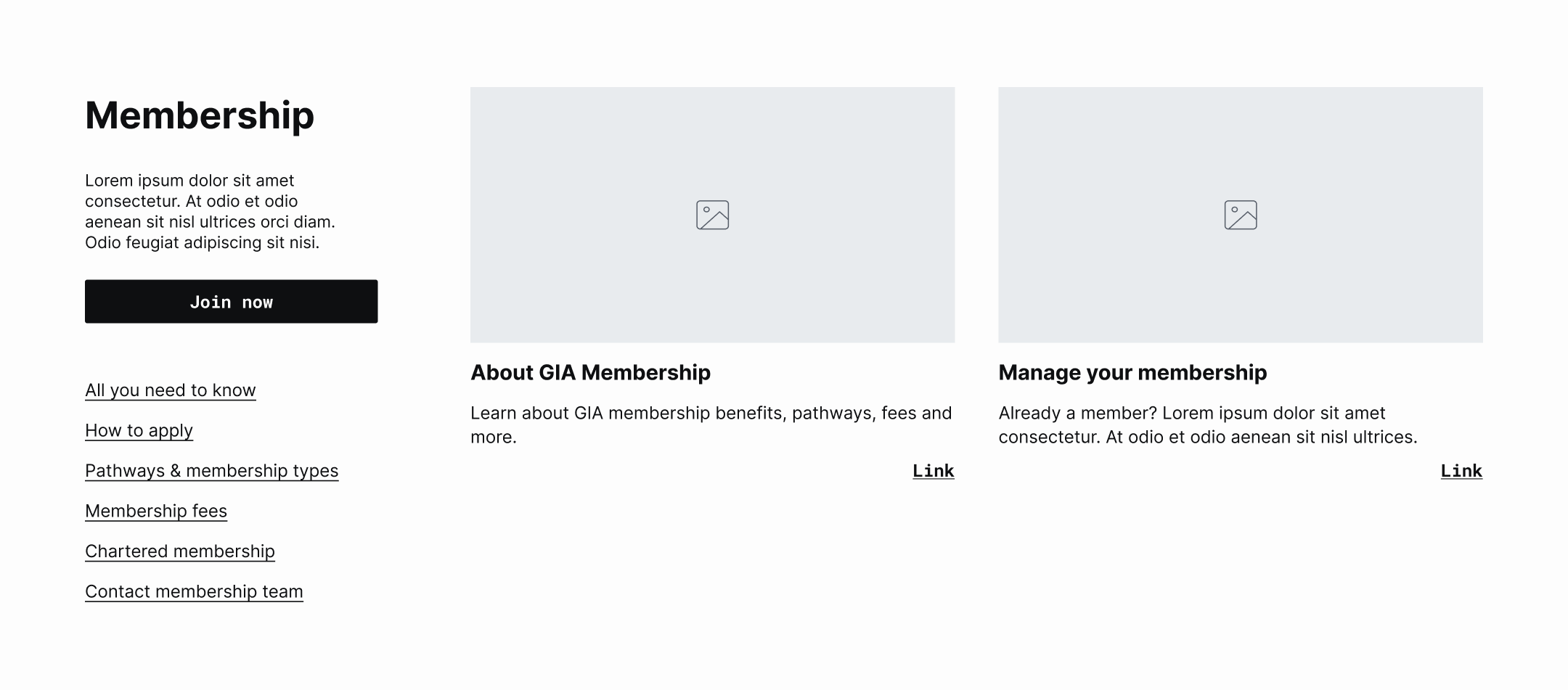
Wireframes
I translated the site structure into wireframes, focusing on content hierarchy, layout, navigation, and key user flows.
High-fidelity designs and prototypes for user testing
After wireframes, I developed the interface into high-fidelity designs and interactive prototypes for user testing.
.png)
%20(1).png)

.png)
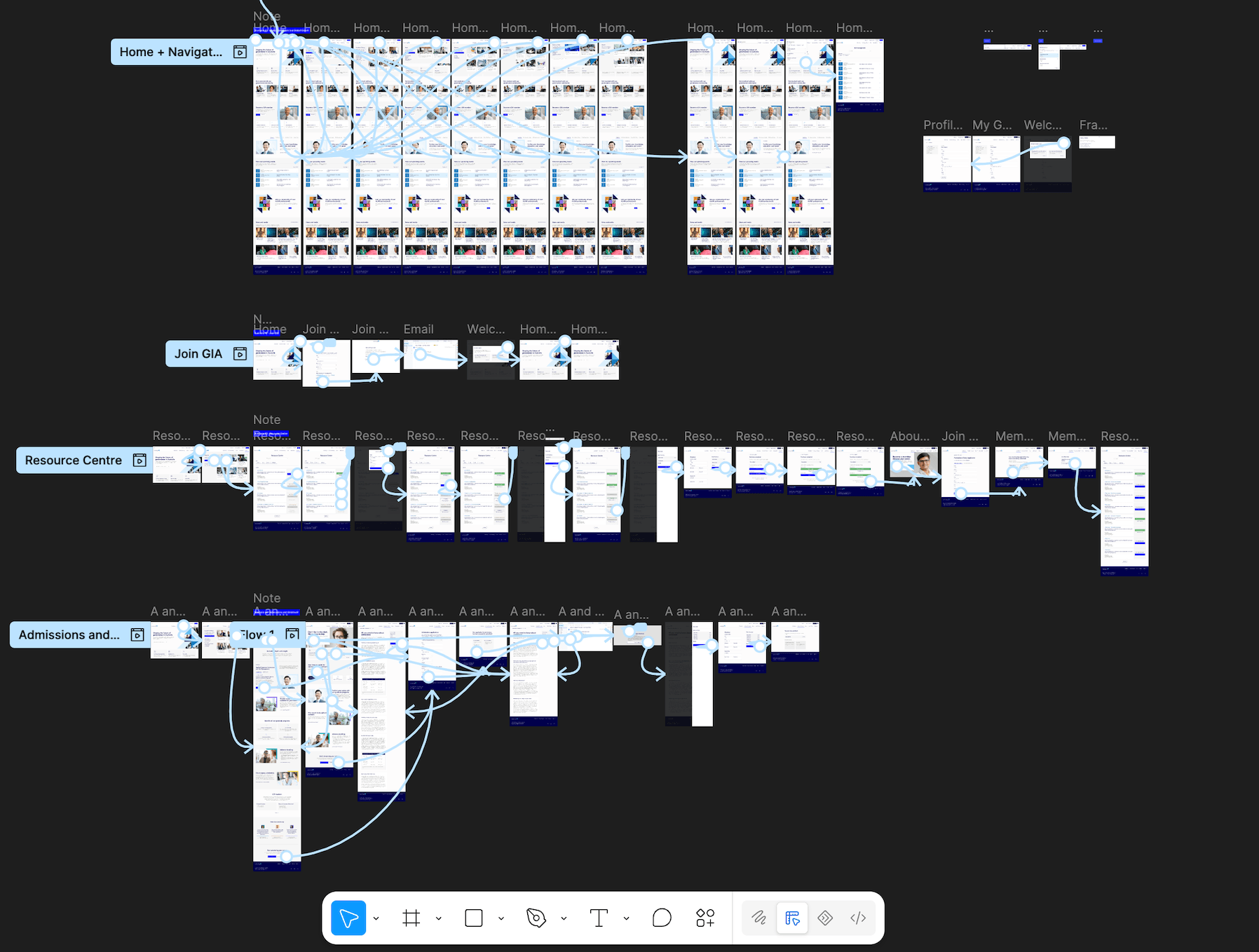
Insights from testing were used to refine the experience, with the final designs packaged into a cohesive UI kit to support a clear and consistent development handoff.
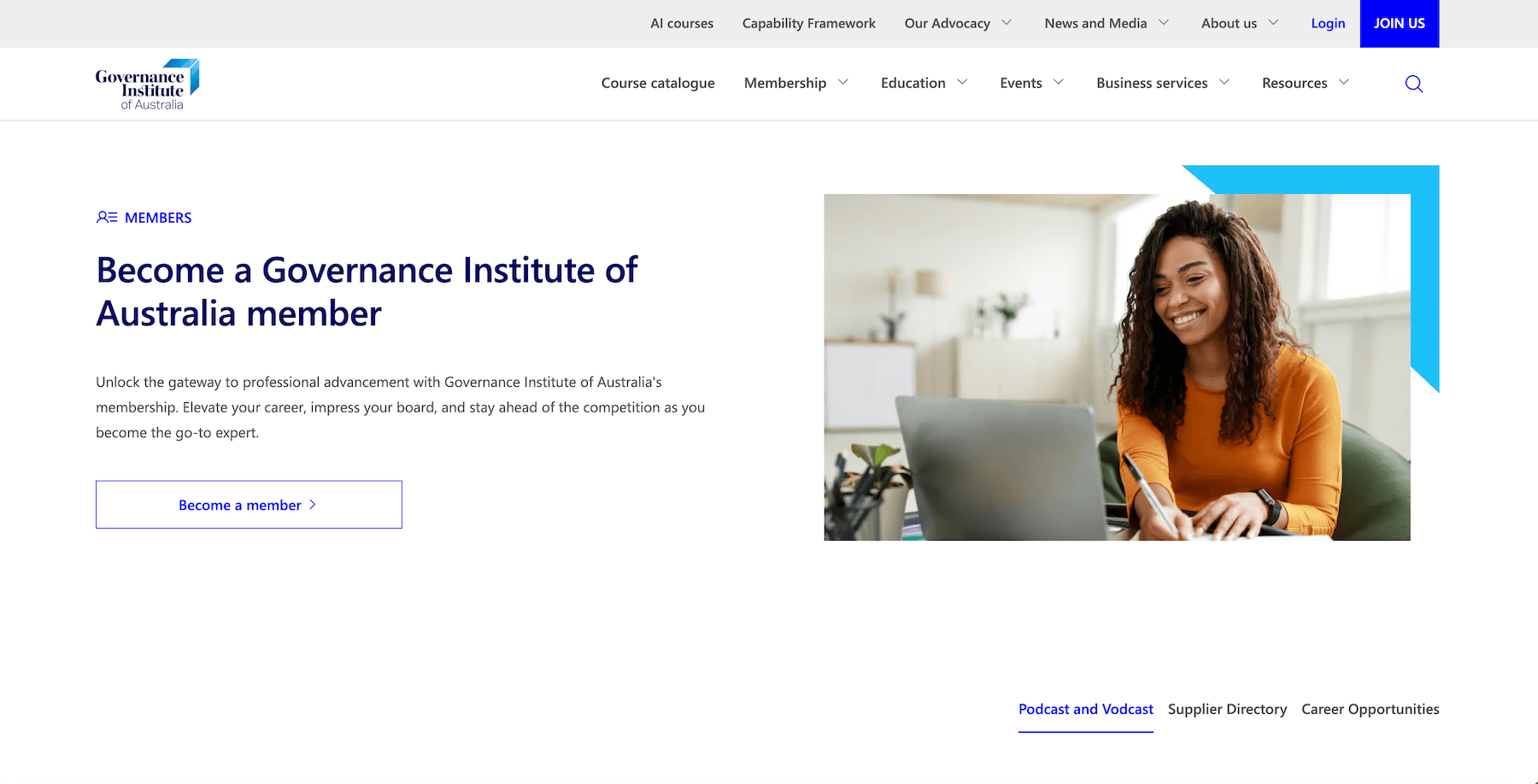
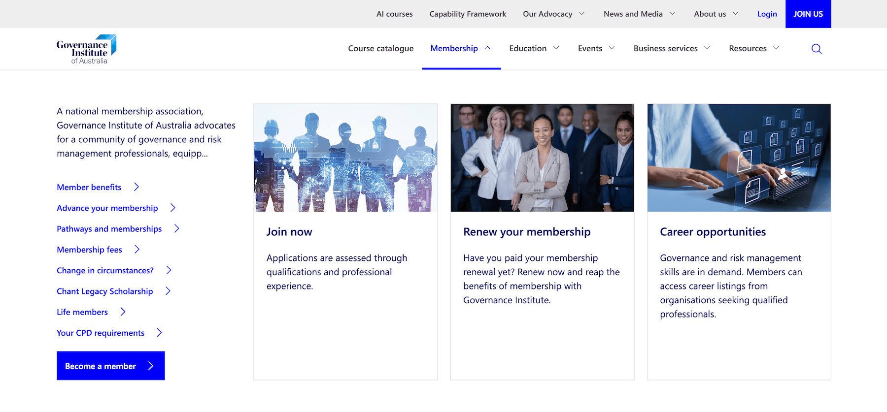
The outcome
The redesigned website delivered measurable improvements across both usability and performance.
Navigation, search, and information architecture were significantly improved, creating a clearer path through a previously complex content environment. The refreshed interface also created a more cohesive and accessible experience that better reflected the credibility of the Governance Institute brand.
Following the redevelopment, bounce rate decreased by 31%, while page load times improved by 6X — resulting in a faster, clearer, and more engaging experience for Governance Institute’s professional audience.
Note: Governance Institute of Australia has since undergone a rebrand, but much of the layout, information architecture, and UX foundation established through this project has been retained.
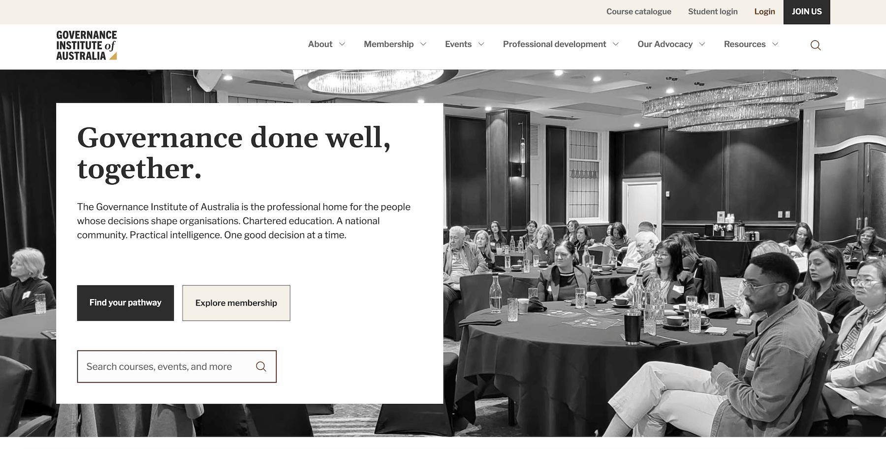
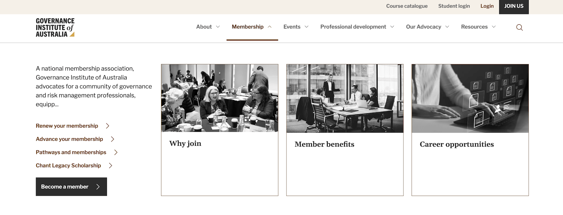
The results
- Navigation, search, and information architecture were significantly improved, creating a clearer path through a previously complex content environment.
- The refreshed interface also created a more cohesive and accessible experience that better reflected the credibility of the Governance Institute brand.
- Following the redevelopment, bounce rate decreased by 31%, while page load times improved by 6X — resulting in a faster, clearer, and more engaging experience for Governance Institute’s professional audience.